Using the Platform — a Thread 🧵
The platform is live at washy-washy.ryankes.eu. It reads the same roadmap and org chart the CLI does, rendered as a page instead of a PDF. Same data, different distribution channel — that’s the whole strategy.
Bundled vs. Active Config
The front page (/) ships with a made-up example roadmap and org — the
same demo data the CLI’s own README shows. That’s what a first-time
visitor sees, and it’s what every page falls back to when nothing else is
active. Think of it as the starter template, not the final deliverable.
Onboarding a config replaces it. The “Onboard config” button in the header
— present on every page — and the fuller upload/download section on
/config both take the same
{ machine, chart } JSON file (see
the roadmap and org chart), validate
it, and store it in the browser’s localStorage. From then on, every page
reads that config instead of the bundled one, until you offboard it.
Editing on /config or /config/machine
works the same way: shipping writes the edited config to the same storage.
Nothing here is sent to a server — a config never leaves your browser, and
a different browser or a cleared site data starts back at the bundled
example. Full data ownership, no vendor lock-in.
/config also has an export link, which writes the currently active
config — bundled or custom — back out as the same JSON shape you’d
onboard. That’s the round trip for editing a copy elsewhere, or handing
your config to a fellow founder.
Dark Mode: My Unpopular Opinion
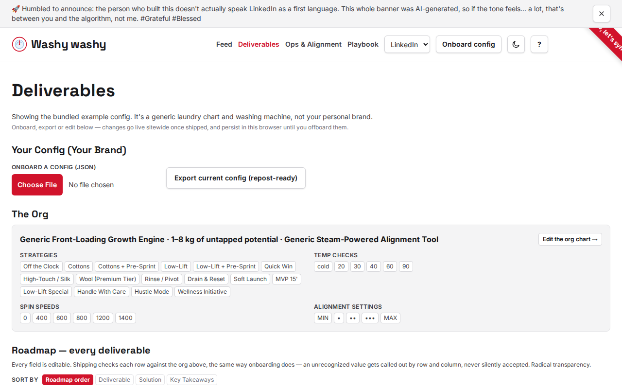
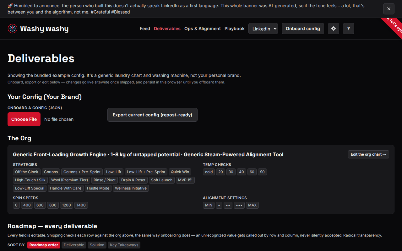
The header also has a light/dark toggle, next to “Onboard config” on every
page. Left alone, the site follows your OS or browser’s
prefers-color-scheme setting — same as before this existed, respecting
your existing infrastructure. Clicking it sets an explicit choice instead,
stored in localStorage, which then overrides that OS setting on every
page and every future session — until you click it again. It’s a
two-state toggle, not a picker: there’s no separate “back to system”
option. Simplicity is underrated.
Keyboard Shortcuts for the 1%
The site also responds to a handful of vim-style shortcuts, mounted once in the header so they work on every page — these docs included, because we practice what we preach:
jandkscroll the feed down and up.gg(pressgtwice) jumps to the top.G(shift-g) jumps to the bottom./focuses the page’s own search field — the deliverable search on the front page, for example — without typing a slash into it.?(shift-?) opens a help overlay listing all of these;Escor a click outside it closes it again.
The same overlay also opens from the ? button in the header, for anyone
using a mouse or a screen reader instead of the keyboard — accessibility
isn’t optional, it’s table stakes. None of these shortcuts fire while
you’re typing into a text field, a textarea, a select or anything else
editable — normal typing always wins.
Filtering: How I 10x’d My Search
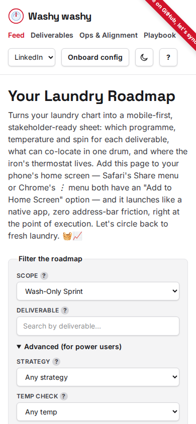
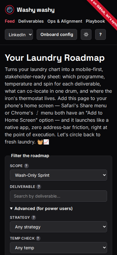
The front page filters by which cut you want (full stack, wash-only, alignment-only) and by a free-text deliverable search, plus an “Advanced” disclosure — closed by default — for filtering by an exact strategy, temp check or spin, and a solution search. All of them narrow the same list; a deliverable has to match every active filter to show. This is what “data-driven” actually looks like.
The strategy, temperature and spin selects only ever offer values that would still leave at least one deliverable showing, given the deliverable search and whatever else you’ve already picked in Advanced — so you can’t pick a combination that lands you on an empty roadmap. The lists update live as you change other filters, and if a field has nothing left that could match, it disables itself instead of showing empty options. No dead ends, only pivots.
Filters persist in localStorage between sessions, the same way a config
does. A filtered view is also shareable: the address bar carries cut,
pile, program, temperature, spin and detergent as query
parameters, and a URL carrying any of them wins outright over whatever was
saved from a previous session — see Share below for the button that hands
that URL off.
Share This Win
Next to the PDF export buttons sits Share this win, which sends the current page URL as-is — filters and all, since the address bar already carries them as query parameters (see Filtering above), so there’s nothing extra to package up. No repost needed, it’s already ready.
If you’ve got a custom machine or chart active (see
Bundled vs. Active Config), the link also
carries that whole setup, appended as a compressed #config= fragment.
Whoever opens it gets your exact machine and chart, not just your filters
— even in a browser that’s never touched your localStorage. Nothing
here touches a server either: a fragment is never sent over the network,
so the link itself is still the entire transfer, the same as an onboarded
config file. Once the page has read and saved it, it clears the fragment
from the address bar — reload or share again from there, and you get the
site’s normal short URL, not the one-time link. A link that’s been
corrupted or hand-edited shows the same row/column-scoped error an
invalid config upload does, and the page falls back to whatever was
already active rather than breaking — graceful degradation, not a
production incident. When nothing custom is active, the link is unchanged
from before — filters only.
It tries the browser’s native share sheet first (navigator.share —
Messages, WhatsApp, AirDrop, whatever the OS offers), falling back to
copying the URL to the clipboard — showing “Reposted! 🔁” the same way a
card’s own Copy link button does — only when that API isn’t available, or
when it’s available but genuinely fails. Cancelling the share sheet is
neither: it’s just declining that one method, so nothing else happens and
nothing gets copied behind your back. Consent-first, always.
Exporting Your Deck
The front page has two export buttons, both scoped to whatever’s
currently filtered onto the page and rendered client-side with the same
@washy-washy/pdf the
CLI’s bun run generate uses. Neither generates anything until you click
it — filtering the page never triggers a render in the background. Lean,
efficient, zero waste.
- Export for mobile writes the same narrow, single scrolling page the CLI produces — meant for reading off your phone next to the machine. The ultimate mobile-first deliverable.
- Export to print writes an A4 sheet instead: a reference table plus one detail card per deliverable, meant to be printed and stuck up — your physical dashboard.
A single card also has its own Export button, for one deliverable at a time. It’s mobile format only — the print layout always draws the whole reference table plus every deliverable’s card, so there’s no way to scope it down to just one the way the mobile format can.
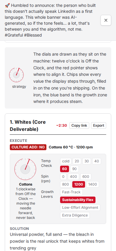
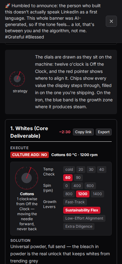
Copy link, next to a card’s export button, puts that filtered view’s URL on your clipboard — the same clipboard fallback the page-level Share button above uses, scoped to one card. Small feature, big impact — that’s the whole playbook.